 |
| This image is of the London Eye and Parliament, this image works as the whole background of the image is dark tones such as greys and blacks. Whereas the foreground of the image, the landmarks, are lighter tones making them stand out in the image. This draws the eye to the image and lets the viewer look at all the different tones presented within the image. |
 |
|
This
image has high sense of chiaroscuro due to the strong white colour next to the
darker tones. This image is a good response to Vera Lutter, as through her work
she looks at a lot of strong building structures. The strong vertical lines in
the image gives a sense of strength and order to the image. Along with it being
a low angle image, making the building appear larger than it is, also giving of
a sense of strength.
|
 |
|
This
image works well as a response to Vera Lutter’s image on Battersea Power
Station, due to the similarities as both images use line and rhythm. The lines
in the image are all quire sharp and precise, showing strength and order in the
image. The grid shown throughout this image shows order, due to the clarity and
accuracy of the lines. I like this image due to the difference in tones
throughout the image.
|
 |
|
This
image is quite bright to the left hand side, and dark to the right. There are
many different tones next to each other within the image. This creates a high
contrast in the image, as the darker right side, makes the brighter sections
stand out more within the image. The eye is first drawn to the brighter areas
of the image, on the left side. It then travels down the houses and to the
darker sections of the image. I believe that creates a successful image and the
viewers eye is travelling through the whole image, and taking the aspects in.
|
 |
|
I
believe this image is a successful response to Vera Lutter. This is due to the
fact that the image works well in negative, due to the sky being completely
black, enhancing the surrealistic feel of the image. The juxtaposition of black
and white in the background of the image complement each other well, as it
allows what is in the foreground to stand out more by emboldening it. The
structures in the image stand out due to their grey tone, against the black and
white of the background.
I then did a review on my shoot:
The aim of my photoshot was to experiment in
the style of Vera Lutter. This means I was trying to show my photographs of
landscaped in negative. To do this I edited the pictures using Photoshop by
first using the brightness, contrast and levels to make the colours stand out
the best they can, showing high contrasts of tones. I then would click the
image tab, adjustments, and then black and white. I then played with the colour
levels of black and white, making some sections of the photograph darker in order
to create a higher juxtaposition. This created a strong sense of chiaroscuro in
the images, much like Vera Lutters. I then inverted the image by clicking
command and I, and adjusted the contrast if it was needed. I believe I
fulfilled my aim, as I took photos of landscape and proceeded to present them
in a negative fashion, much like Lutter. I believe I edited the images well,
and they were a good response to Vera Lutters. I found it challenging to find
buildings, which had lots of different tones to photograph. As the image became
inverted and black and white the tones are shown through whites and black, so
finding things with lots of tones to photograph proved to be harder than I
thought. If I were to do the shoot again I would look at camera obscurity and
make a pinhole camera and try to photograph the images that way.
I then did a response to Christian Sampson which looked at anorexia
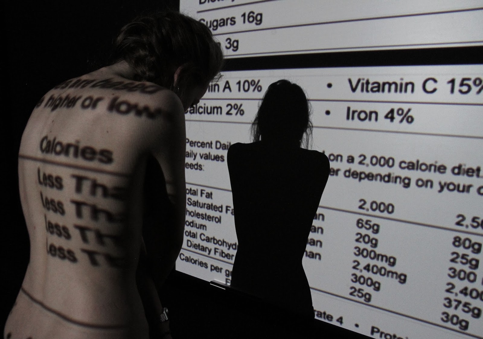     This is the review I wrote on that shoot: My aim of this shoot was to show emotion using a projector and body language. I wanted to make my shoot shocking and have a lasting impression on my audience, so to do this I decided to have the subject without a top on and focusing on her back. This has more of a shocking factor then if the subject was clothed, as this way you can clearly see the muscles and bones and a stronger impact is made through the images, in my opinion. However, another strong idea was to have the subject in over-sized clothes to show the weight loss, however I felt, in order to create a stronger impact and really get my message across the subject should not wear a top. To complete this shot I used a projector and had the subject stand in front of a plain, blank screen. Then to edit the pictures, I would take away some of the vibrance and colour within the images in order to make the pictures, slightly more darker and serious. The only lighting from the shoot came from the projector for maximum impact, the darkness surrounding her represents how she feels trapped and how her mental illness is putting her mind in a dark place. The projector molds the nutrition facts around her body, suffocating her and really playing on the feeling of a mental illness causing someone to feel trapped and isolated. I believe these photos came out well, and portrayed my message clearly and shows the state of mind a mental illness has on people using atmospheric through lighting and body language. |


Here is the review I wrote about that shoot:
When taking these photos, light was a
very important aspect; I had to make sure the lighting was correct in order to
create a backlighting effect. In this shoot I used two professional umbrella
lights behind a white sheet. The two lights behind the sheet creates a
backlighting effect, this way a person becomes like a silhouette and you can’t
see their facial expressions clearly. I played around with having the subject
in front and behind the sheet, and having one person in front and people
behind, looking at the difference in the silhouette. I also experimented with
having the subject underneath the sheet, however these did not work out as well
as I had hoped. An important element in this shoot was light. In order to get
the light exactly light the room had to be completely dark, with the only light
coming from the umbrellas. To do this I blacked out the windows by putting
black card over them, I then closed the curtains. I then closed the door to the
room and covered anything that caused light. This way the only light source in
the room was the umbrellas. To edit these photographs I used Abode Photoshop, I
used the levels tool to intensify both the dark and light areas of the image.
This created a more of a silhouette look. I think this shoot works well in
response to Kara Walker and J Wells, as I used the element of light and black
and white, which is featured in both artists. I think the photographs of the
subject being behind the sheet work better, as they are more aesthetically pleasing
and give a stronger sense of emotion. I also tried printing some of the images
on acetate and layering them together. Also to develop this shoot, I will use some of the negative edits
to develop the images in the dark room. To develop this shoot further, I am
going to look at showing emotion without the using the face further. To do this
I will take portrait images and then using different tools blur out the face in
a manner that will represent emotions and inner feelings still.
This is how layering some of the images on acetate turned out:


 |
|
For
this image, I used the magnetic lasso tool to go around the subjects face, once
that was highlighted I selected the black pen and coloured in her face. This
was the body seems emotionless as there is nothing special about her body
language and we cannot see any facial features.
I then developed this shoot to show no emotion at all: |
I then did a development shoot looking at taking away the emotion in an image:
 |
|
To
create this image, I used Abode Photoshop, using the clone tool I picked up the
edges of skin around features such as the mouth and eyes. And used that to
cover up the features. This was hard as due to the lighting her face was all
different shades therefore making it hard to pick up one skin tone and have it
match well.
|
 |
|
For
this image I used the black pen and scribbled out over the face, this way you
are unable to see any features enough to extract her emotions from them.
|
 |
|
For
this image I again used the clone tool, I tried to make the skin as even as
possible by due to the lighting change it was hard. I believe this image works
well at not showing emotion as all the key features of the face are hidden.
This is the review I wrote on this shoot:
In this development shoot I was
experimenting with making the images turn emotionless in Photoshop. As in Kara
Walker and J Well’s image it is all about portraying the emotion through body
language, I wondered what if there was nothing special about the body language
and the facial expression was blank. As it is near impossible to wipe
expression from someone I decided to use Photoshop to take out the key features
that show expression in the face. Such as the eyes, eyebrows, mouth, nose, and
lips. I did this by either using the clone tool or drawing them out. Using the
clone tool has an effective look on the image, however was hard to use do to
the different areas of skin being different colours. To improve this shoot I
would make sure all of the lighting levels are even. I am going to do a
physical editing of this shoot and experiment with erasing the emotion
physically, with scratching the image out.
I then did physical edits:
|
 |
|
For this edit, I again used a scalpel
and went around the face of the girl, completely cutting it out. To do this I
also used a cutting mat for safety reasons. I think this idea works well as it
erases all emotion in the image, as her body position is neutral and you cant
see her facial expression. However as I have cut her face out, it can imply the
feeling of emptiness as we can see through the girls face.
|
 |
|
I used a scalpel to remove the top,
colour layer on the print, so it was left with white where her face was. I
think this edit works well as it erases all aspects of emotion in the face as
it also takes the colour away from it. It was hard to make the face completely
white as the ink smudges onto the white as I was scratching it off.
|
 |
|
To do this edit I used acrylic black
paint and covered the girls face. I think the ink worked better than the
acrylic as I found the acrylic hard to work with and place the way I wanted it.
|
 |
|
To do this image I printed the portrait
image onto photographic paper, I then used ink and in a spiral motion, I
covered her face in the ink. I like this image, as the ink was easy to use and
have the way I wanted it to look.
|
 |
|
To do this image, I used scissors to
scratch the face out; this makes the expression not impossible to see, but very
hard. I like this edit as you can really see the texture of the scratches on
her face.
|
I am now looking at photographer Gillian Wearing who looks at emotion through the use of wording and signs. I am creating a series of photos for this shoot, these are the six I already have:
 |
|
For this image, we were outside on a
public street, the subject chose to write ‘I like coke zero J’ He then proceeded to hold
up the sign, not smiling, looking dead into the camera. As it was around 8
o’clock it was dark outside, so due to the flash he is the main focus and
center of the image. The facial expression he holds is almost solemn, it’s very
emotionless, along with his upright body language. So what we learn about him
in solely through the sign saying ‘I like coke zero J’ the focus of the image is
on the sign, as I wanted the eye to be more drawn to the sign then the person. This image is called 'Jordi'
|
 |
|
This image was taken against a plain
white wall in a library, the guy chose to write out his girlfriend’s name and
pose with the sign, looking to the side slightly. In this image the sign is the
center point of the image and in focus, while the rest of the image is slightly
out of focus. This is because I wanted most of the attention to be drawn to the
sign and not the person. This image is 'Delman.'
|
 |
|
In this image, we see someone sitting on
a wall outside holding a sign saying ‘Will the EU ever collapse?’. When I asked
him to write down anything he wanted on a sign his first question was ‘can it
be to do with politics?’ Which shows straight away from the sign he is very
interested in politics and the EU’s state. The guy in the image is smiling
slightly and looking at the camera, showing he has confidence. As it is dark
outside the flash lights only the subject on the image, making him stand out
from the dark background. This image is called 'Omar'
|
 |
|
This image was taken in a coffee shop
and when I asked the girl to write anything down, she asked if it could be
relating to her boyfriend, if she could write “2 years”. Her concern was, that
to others, would not understand her sign. I told her to write what she wanted
to and not worry what others would think. She then proceeded to write #2Years
and took the image. The image is a shallow depth of field as she is the only
thing in focus in image; the background is slightly out of focus. This image is 'Fareena'
|
 |
| This image is 'Scales' the picture was taking against a white wall in a public library; the sign reads ‘Yes I am gay get over it’. The guy is standing with his right side slightly forward and looking dead into the camera with a slight pout. This shows the guys confidence with himself. As the wall is plain the eye is drawn instantly to the subject of the image. |
 |
|
This photograph was taken in a coffee
shop, and when asking the girl to take a photo the first thing she said was
“don’t ask me why I have a dinosaur on my face” so when she went to write the
sign, that is what she wrote down. When taking the image she first was looking
dead at the camera, she then turned her head saying “no take another to get the
dinosaur in, it’ll make more sense then” She then turned her head to the side
slightly and smiles slightly, while holding the sign just below her face. This image is 'Dee'
|
I have started making a montage of the image (as seen below), but I have however left room in that montage to add at least 6 more images. As in my series I want to feature at least a dozen photographs.

This is the start of the review I am writing for this shoot:
I believe this shoot worked well, as it
shows an insight to peoples emotions, but only enough for them to show you what
they want you to know. I believe the downside of this shoot is that all the
subjects know me. As I tried to ask strangers on the street to join in my
project, however people became unwilling once I told them they would have to
write one of their thoughts down. I believe this is to do with the minds
self-conscious. People do not want to be judged by others, even if they did not
know them. That is why I feel this shoot did not work as well as I would like,
as all the subjects know me they had a filter on what to write down. I could
tell this as when I asked people to write something down on the sign, a lot of
subjects went to write something straight away, however then hesitated. They
then would sit there and think about what to write for a while, they would also
tend to ask me and people around them. This is to do with self-conscious; we do
not want people to judge, so therefore turn to them to help when we feel self
conscious with what to write ourselves. After telling people they could not ask
for help they asked what other people had previously written for an example.
This again shows how people do not want to step out of their comfort zone if
others are not doing the same. A few subjects asked if their friends could
leave and not watch them take the photo, as they wanted to express their
feelings without feeling embarrassed and watched. I also let people pick the
colour of their pen, just so I could get the most out of their personality as
possible in one sign. Everyone I asked to photograph requested to see the
images after taking them, some people asked for their image to be retaken. This
emphasises how people worry about what others would think of them and want to
make sure they look nice before others see the image. I believe taking these
photos showed a lot about peoples inner emotions and thoughts due to how they
reacted when asked to write down anything and take a picture with it. Whereas
strangers would feel like they have nothing to prove to the photographer and
had the security of writing down anything and only have the photographer see
it, and they would never see them again. As they would not have the filter that
people I knew and are friends with had. Unfortunately I failed to find many
willing strangers. If I was to re-do this shoot in order to improve it I would
try and get more willing strangers on board.
In order to develop this shoot I will
try writing the things over the people face, I will take a photo of people and
ask how they were feeling when I took the image. I will then show this through
physical editing by writing the emotion over the image.
No comments:
Post a Comment